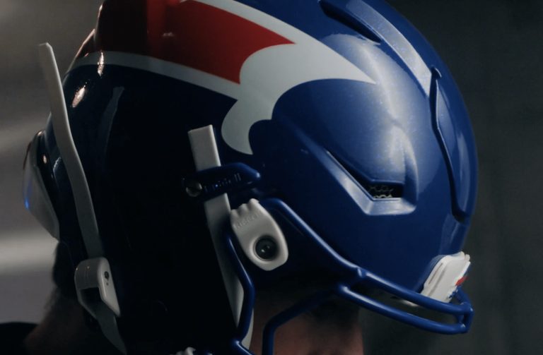
The Buffalo Bills recently unveiled their new alternate uniforms, dubbed the ‘Nickel City’ design. The uniforms have been met with widespread criticism from fans, who feel that the design is unappealing and does not accurately represent the team.
Design Criticism
The ‘Nickel City’ design features a grey and blue color scheme, with red piping. However, many fans feel that the design is too similar to that of the Detroit Lions, and that it does not evoke the spirit of the Buffalo Bills. The helmet design, which features a red streak, has also been criticized for its resemblance to a ‘butt farting a stream of blood’.
Despite the criticism, the Buffalo Bills have stated that the new uniforms are a tribute to the city’s blue-collar workers. However, many fans feel that the design is a mess and that it does not accurately represent the team or the city.
Original reporting: All Sports Feed (HLL/CB) — read the source article.