Meteorologists from around the world, including those in Connecticut, showed their ‘warming stripes’ on Saturday, June 20, to raise awareness and start the conversation about climate change.
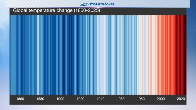
Visual Representation of Climate Change
Each colored stripe represents the annual average temperature relative to a long-term average. Red stripes are years that were hotter than average, while blue stripes are years that were cooler. In Connecticut, the hottest year was 2012, and the state follows a common trend of red stripes in recent decades, reflecting rapid warming due to heat-trapping pollution.
Kaitlyn Trudeau, an Applied Climate Scientist with the non-profit organization Climate Central, explains that the stripes are ‘really meant to be simple and be a visual communication tool that we can use to start these conversations about our changing climate, what’s going on and why it matters.’
The red stripes in recent warm years increase extreme weather, which can lead to impacts on health, agriculture, and economies around the world. Trudeau notes that ‘seeing so many of the oranges and reds in recent years, it tracks with what I feel like we’ve experienced, but it’s really concerning.’
The tradition of showcasing warming stripes on or around the first day of summer in the Northern Hemisphere was started by Ed Hawkins of the University of Reading in England.
Original reporting: NBC Connecticut (Hartford) — read the source article.


